7. Making it Responsive
This tutorial will go through the process of making a site responsive. It will use your main index.html file and its associated CSS file to make your homepage go from two columns on larger screens to one column on smaller screens.
Step 1: Open Your Repository and Files
Open your repository in Atom and then open up your main index.html file and CSS file associated with it by double clicking on the files in the tree view.
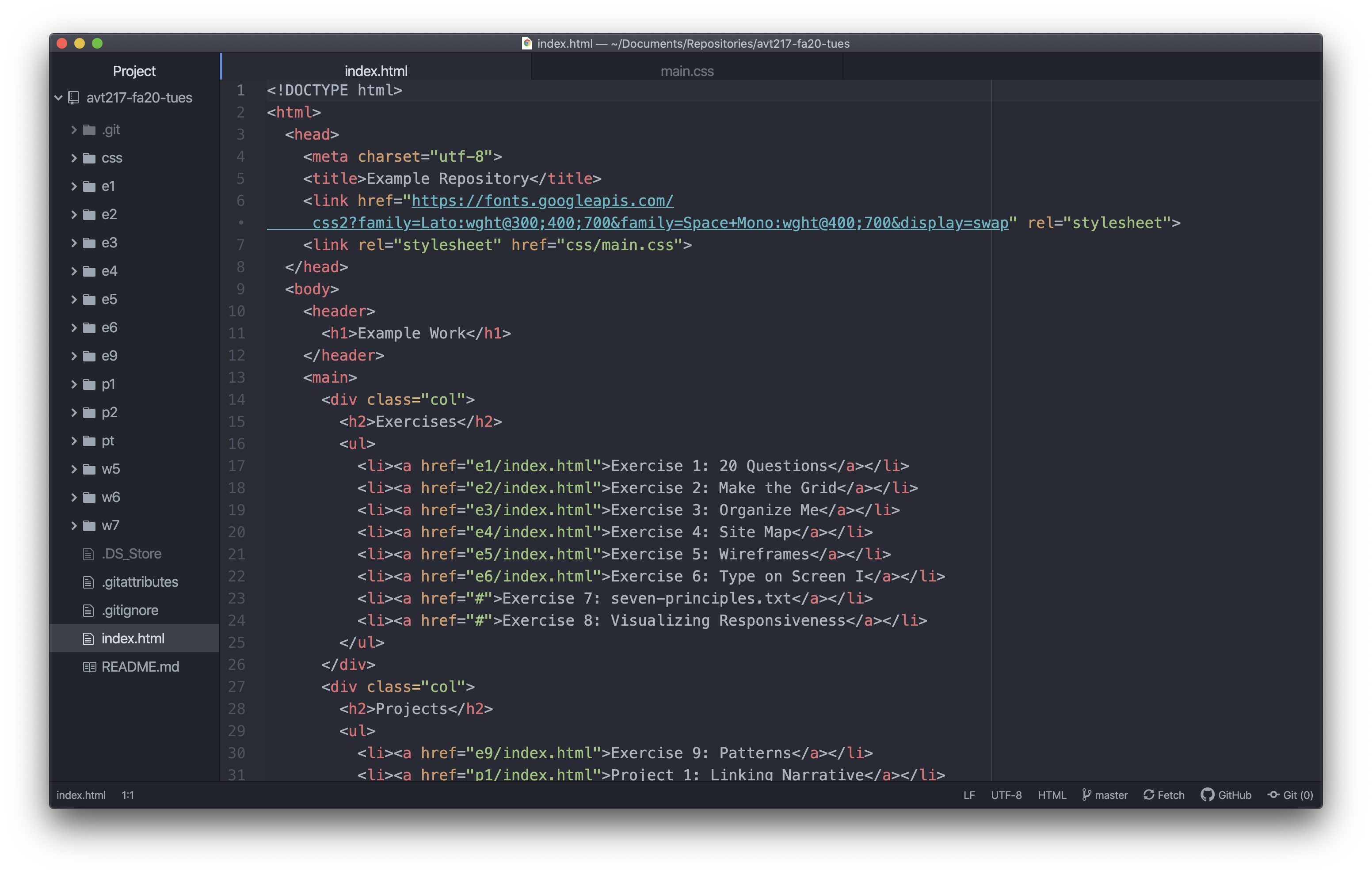
Really the main focus here is the CSS file but we might want to reference what is happening in the HTML file so it is worth having them both open. Your HTML file should be set up similarly to the screenshot below.
Step 2: Write the Media Query
The first part of making a responsive site is writing the media query where we will add our responsive styles. Once we have the media query written we can start to add styles that will only happen at a certain range of screen sizes. In this case we designed the desktop version so we want the media query to happen when the screen gets smaller.
Open up your site in a browser and start making the window smaller. There will come a point where the two columns on the homepage start to get too close together, start touching, or the columns are too narrow. Once you find that point, get the width of your browser by going to a site like howbigismybrowser.com. Look at what the width is and remember that number for when you write your media query. For my site it is around 900px.
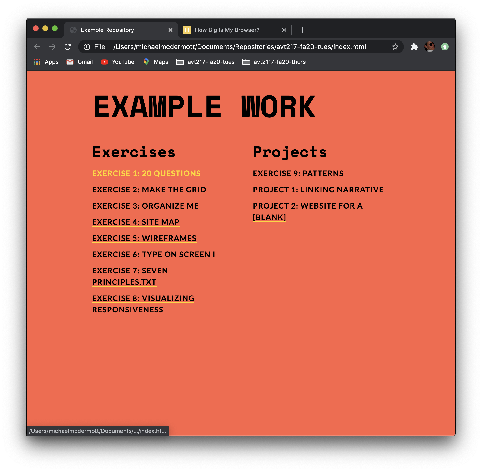
You are going to write the media query in your CSS and you need to add it after all your main CSS styles. So scroll to the bottom of your CSS file and write @media screen and (max-width: 900px) { } with the number after max-width the number you came up with above.
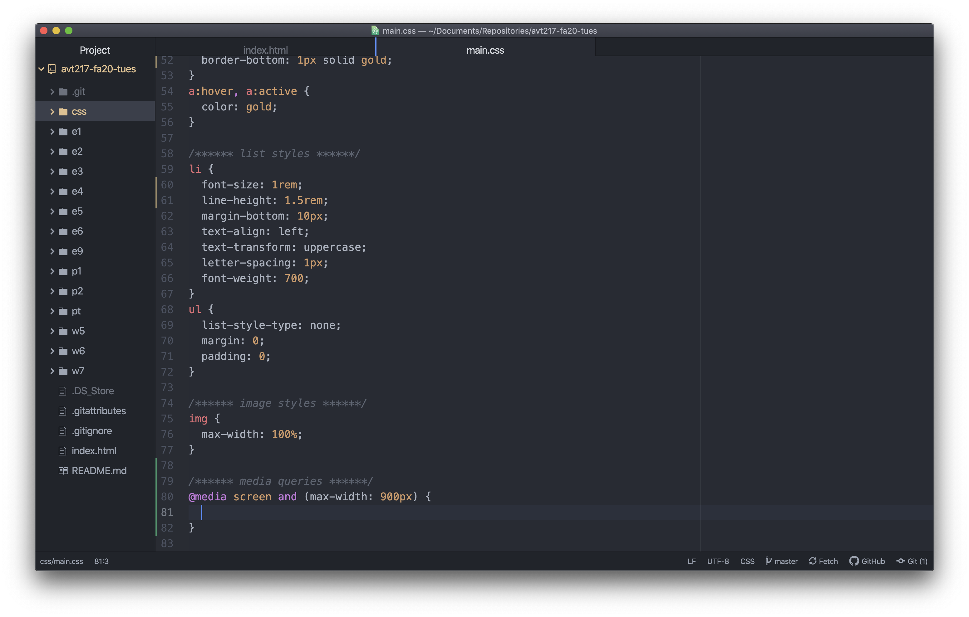
Make sure when you add this you do not have a semicolon after the value for max-width and you include the curly brackets with an empty line between them like in the screenshot above.
Step 3: From Two Columns to One
Now that the media query is there you can start to write some styles for what happens when your site is viewed at a width of below whatever number you used. So you are writing styles to override your base styles when the screen is between 0px wide and your max-width value wide.
Let’s start with something easy to make sure your media query is written correctly.
Step 3a: Check if the Media Query Works
Inside the media query write a style to change the background color of the body to something different. Make sure when you start writing the selector you are indented one level because all of these style rules go inside the media query. I changed the background color for my body to a light grey.
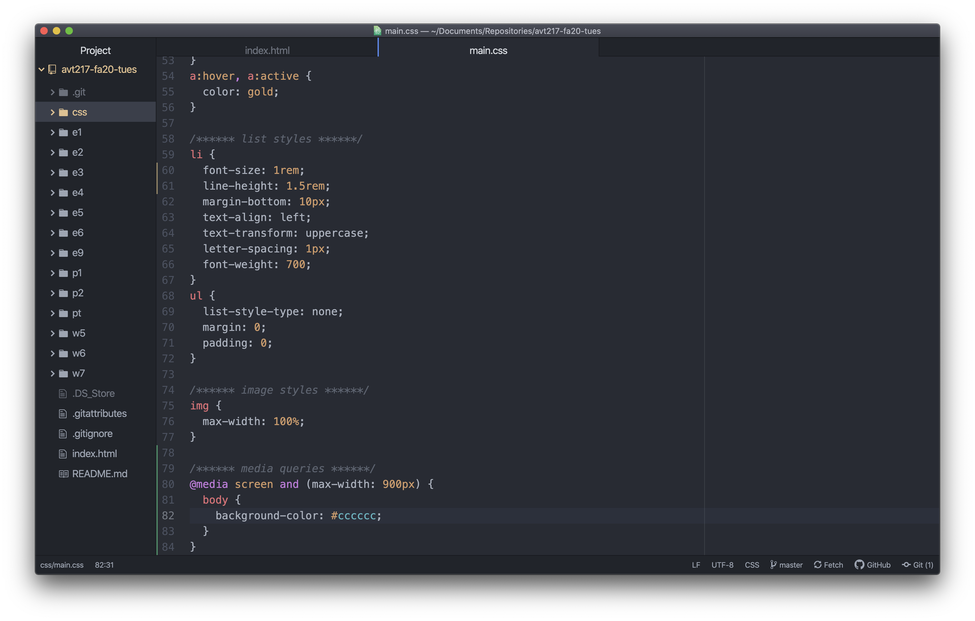
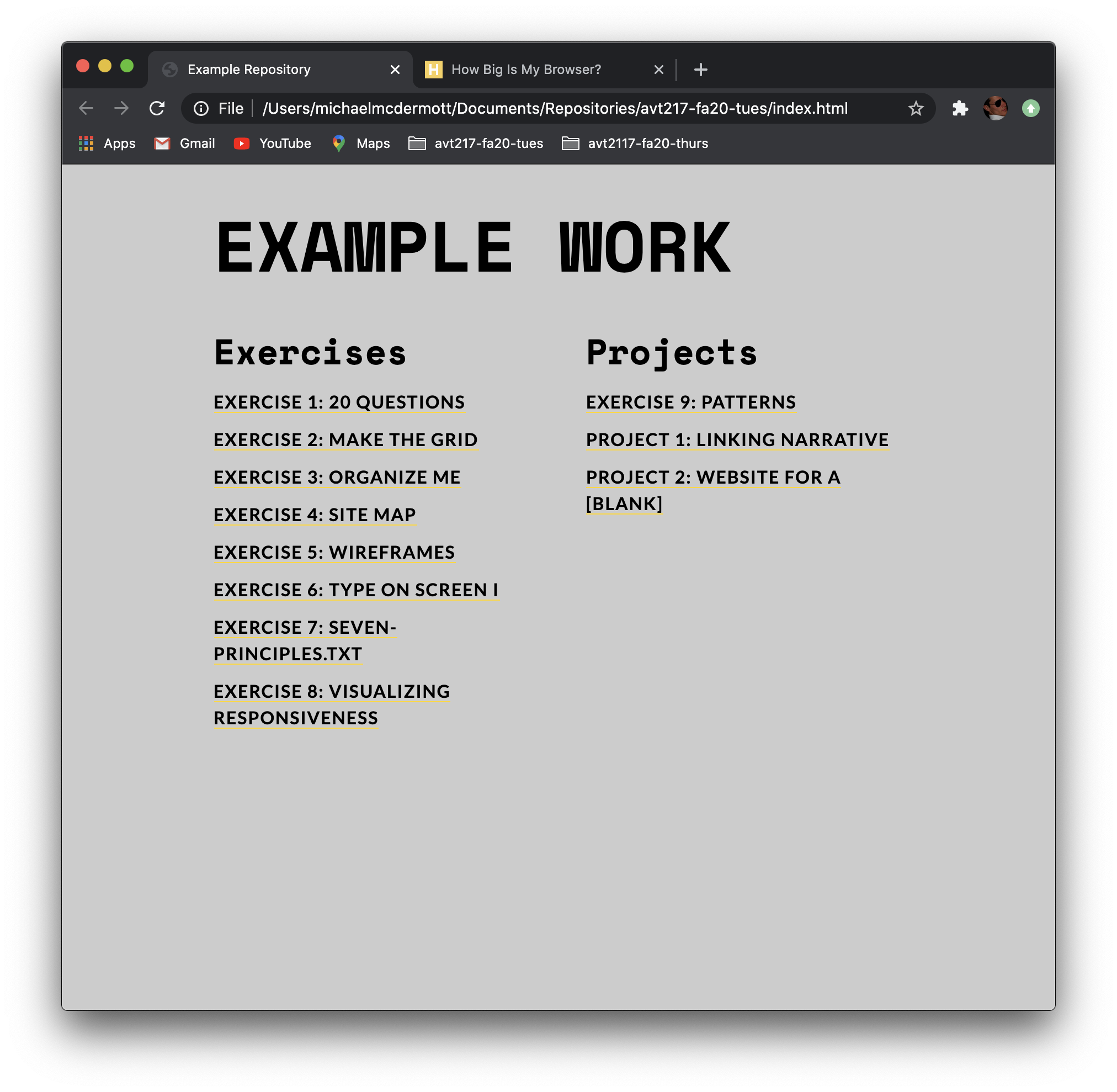
If your change doesn’t happen go back through step two and make sure you are writing your media query at the bottom of the CSS file and that you don’t have a semicolon after the value for max-width.
If your background color changes, carry on.
Step 3b: Adding Style Rules to the Media Query
The main thing we want to do with this page is to go from two columns to one column. At a certain point two columns isn’t practical on smaller screens so instead of having two super skinny columns we want to make one column for a better reading experience on the smaller screen.
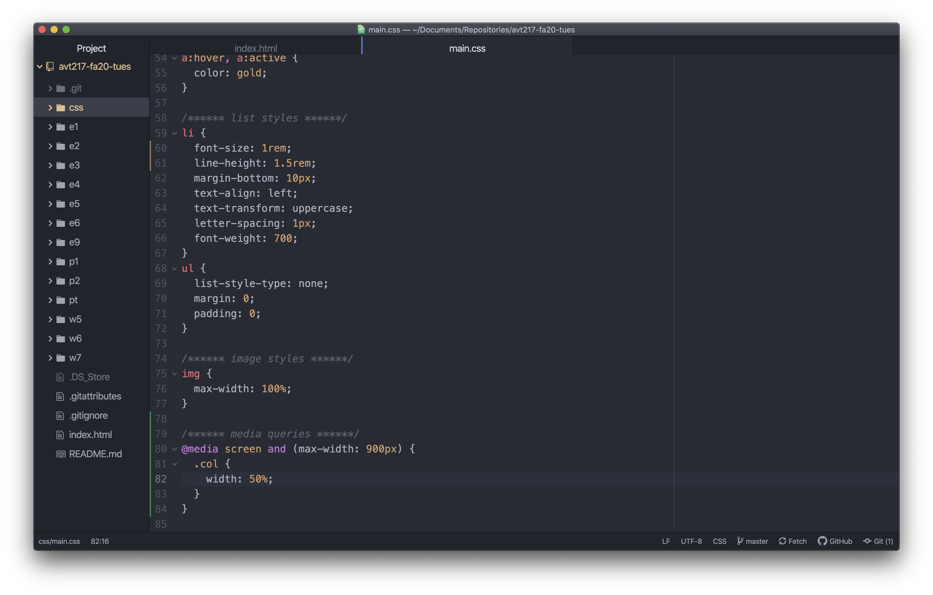
To do that we need to override some of our column styles from the main CSS. If you scroll up in your CSS to look at the styles you have that control your two columns you should see something similar to this:
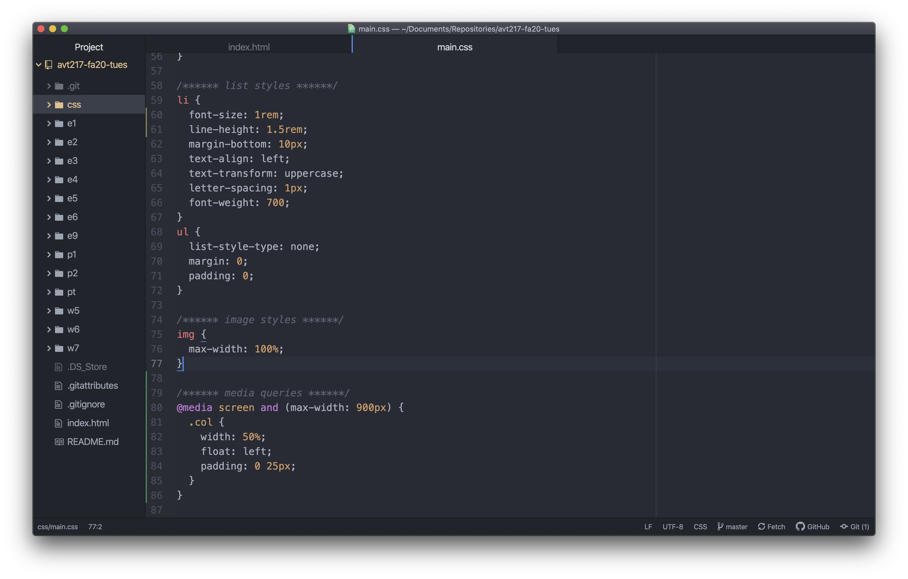
Copy and paste that whole style rule down into your media query and delete the body style rule. Again making sure everything is properly indented.
Step 3c: Deciding What Needs to Change
We don’t need all of these declarations in this rule so let’s decide what we want to change here. The main property that is allowing our two columns to work is the width property. You might have answered the float property which is sort of true but that property won’t do anything unless the other property allows it to. So since you really only need to work with the width property you can delete the other two declarations because you don’t need to change anything about them. Remember, the only styles in a media query are ones you are overriding/changing from your main styles or that are entirely new styles.

Step 3d: Changing the Value
Now that only the width property remains, what does the value need to be to make the change we want? If 50% is giving the space necessary to float two columns next to each other and now we only want one column, the value for the width should be changed to 100%. This way the column takes up the entire width of its container (the main element) and nothing can float next to it because there is no room.

Step 3e: Adding New Styles
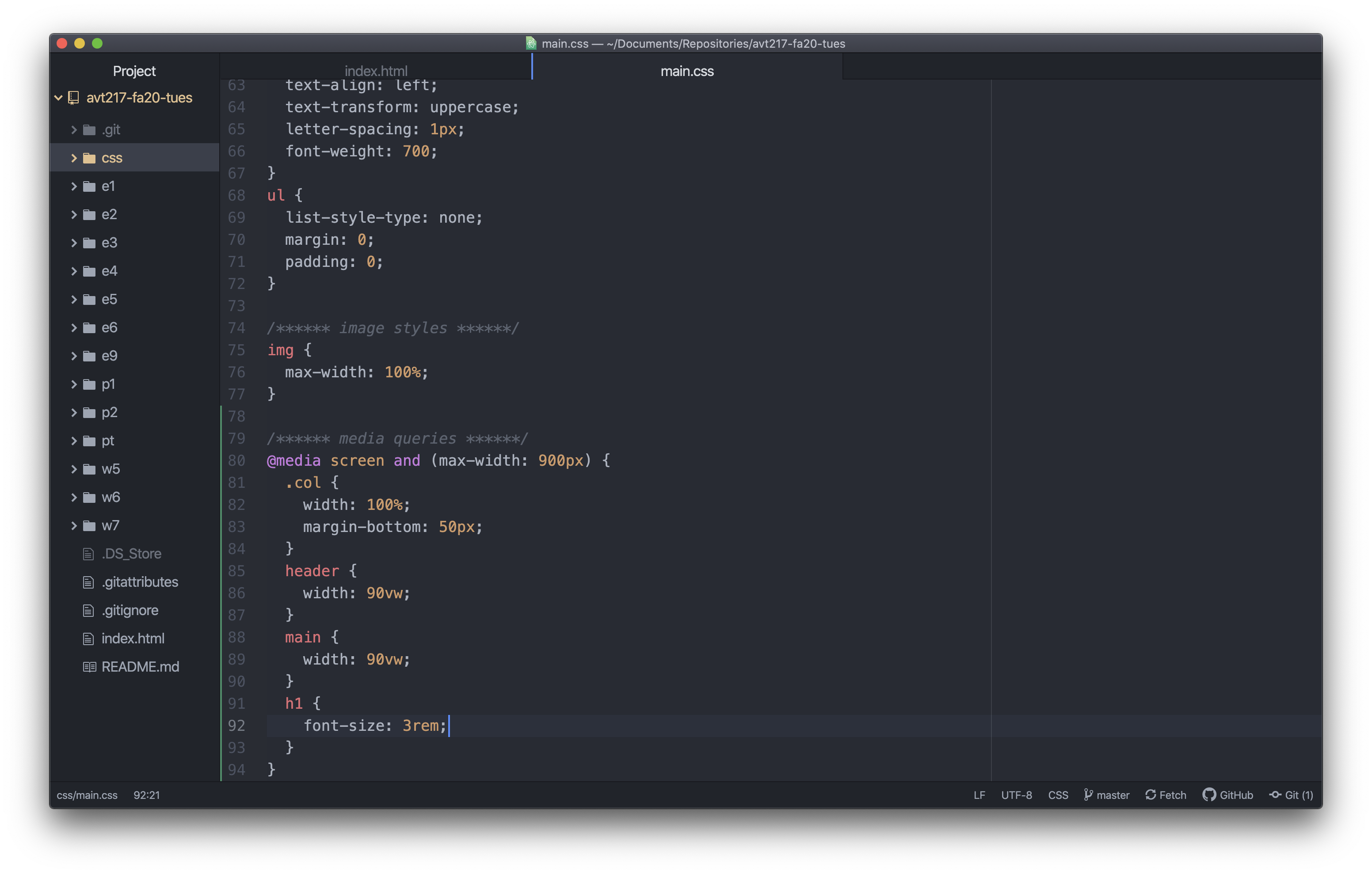
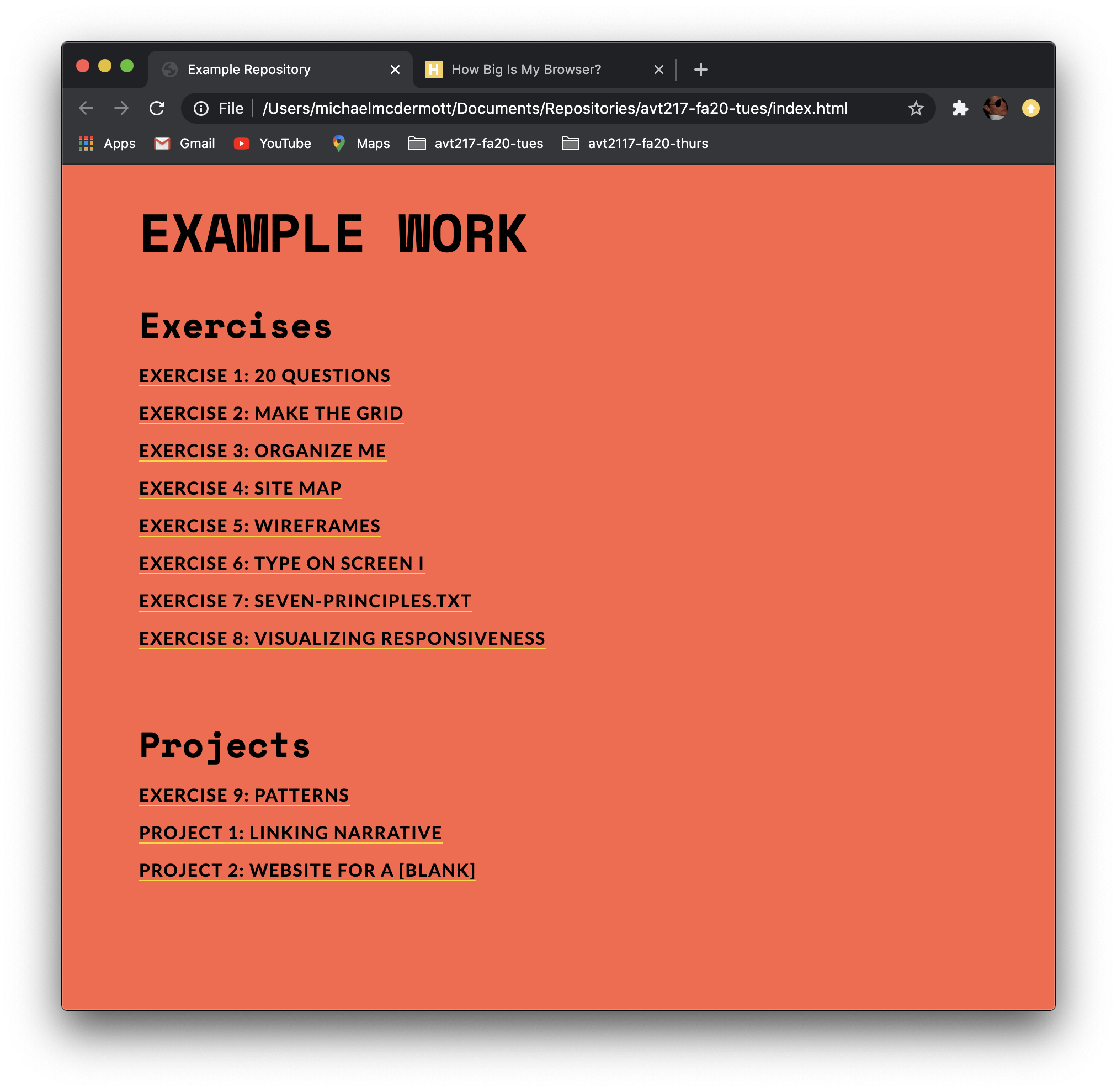
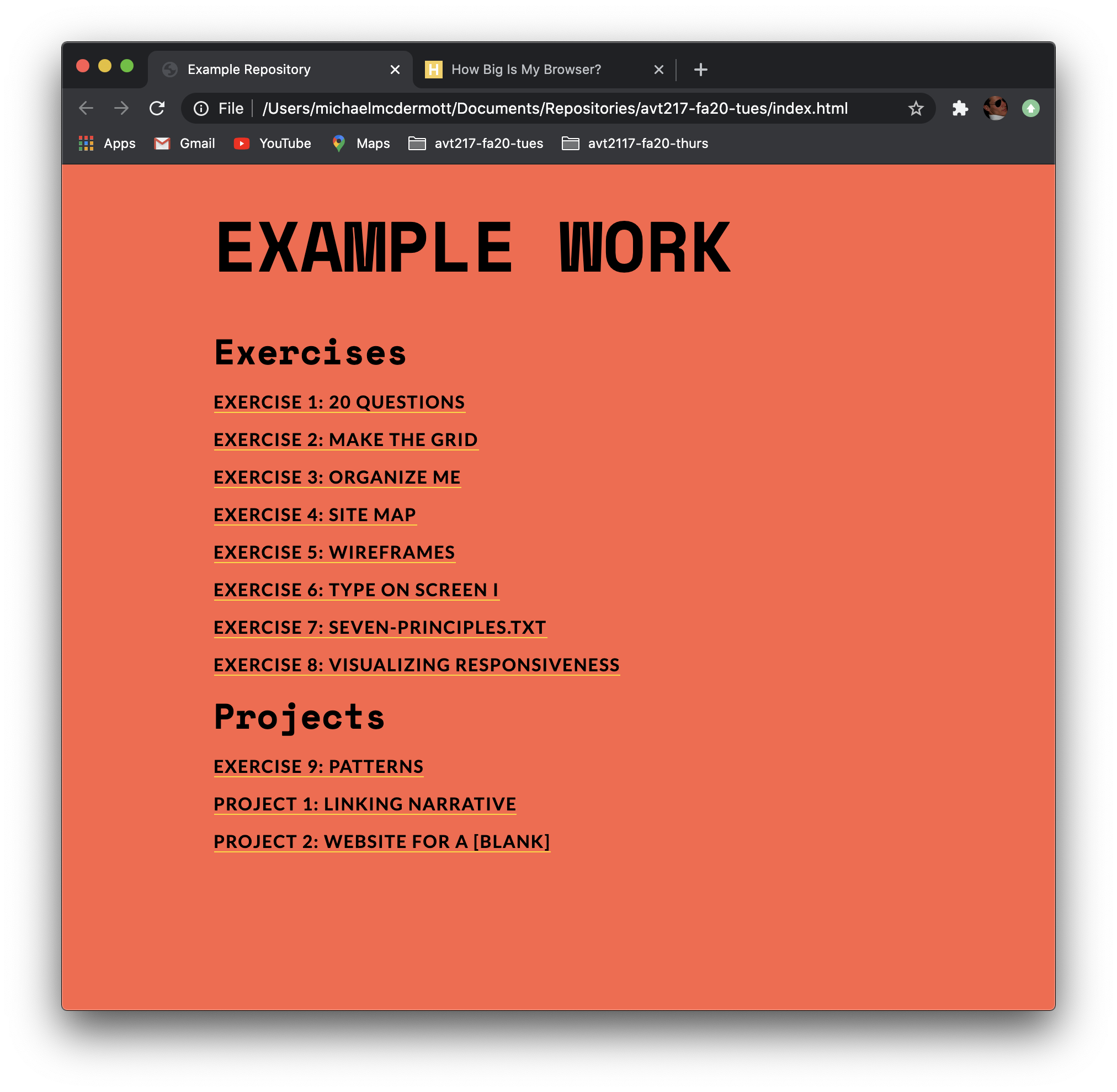
The final thing we want to do here is add any new styles that we might need to make the page look the best it can. In the screenshot above the word Project is too close to the last item in the list of exercises. That is an easy fix by adding a margin to the columns.
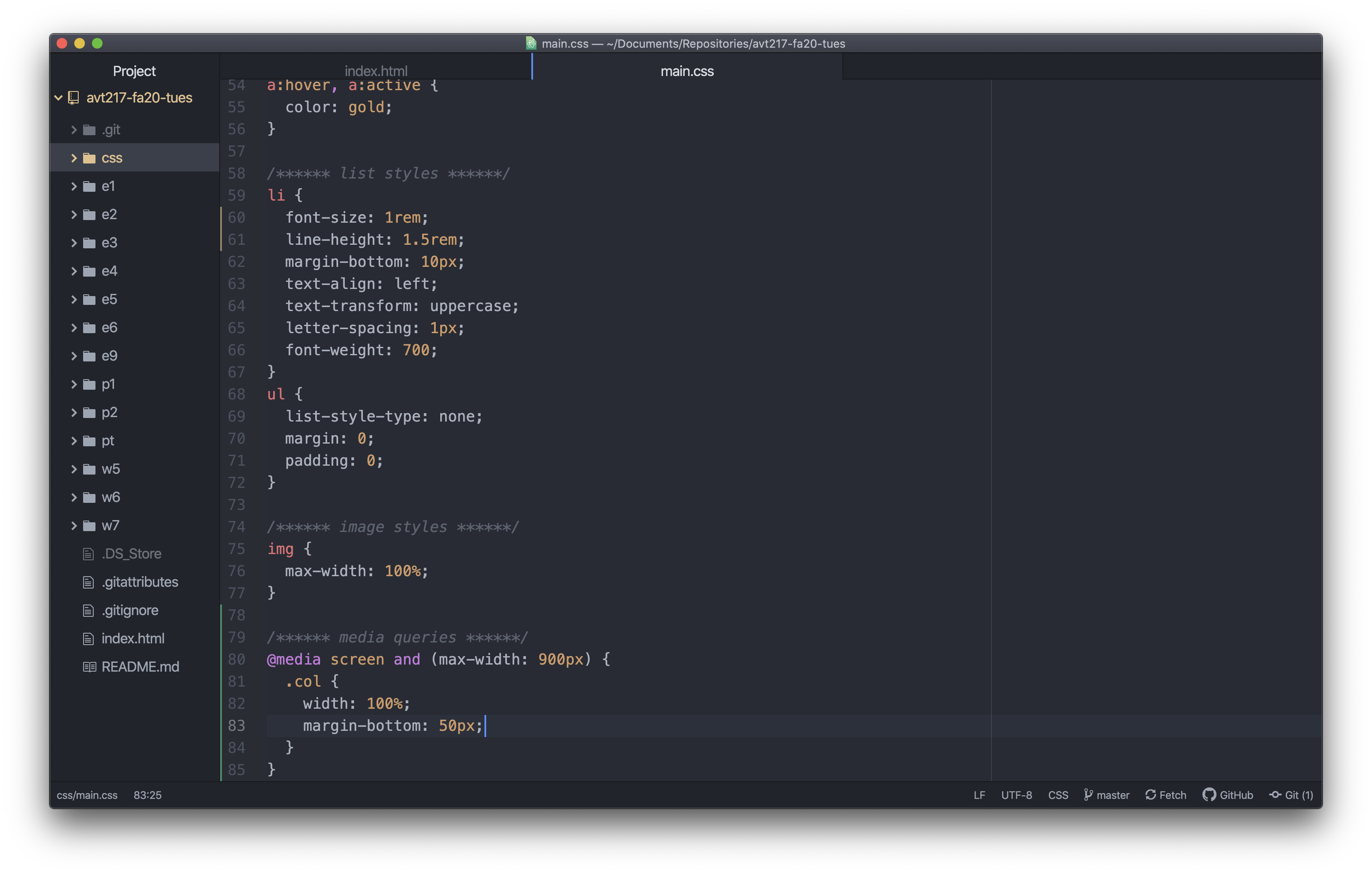
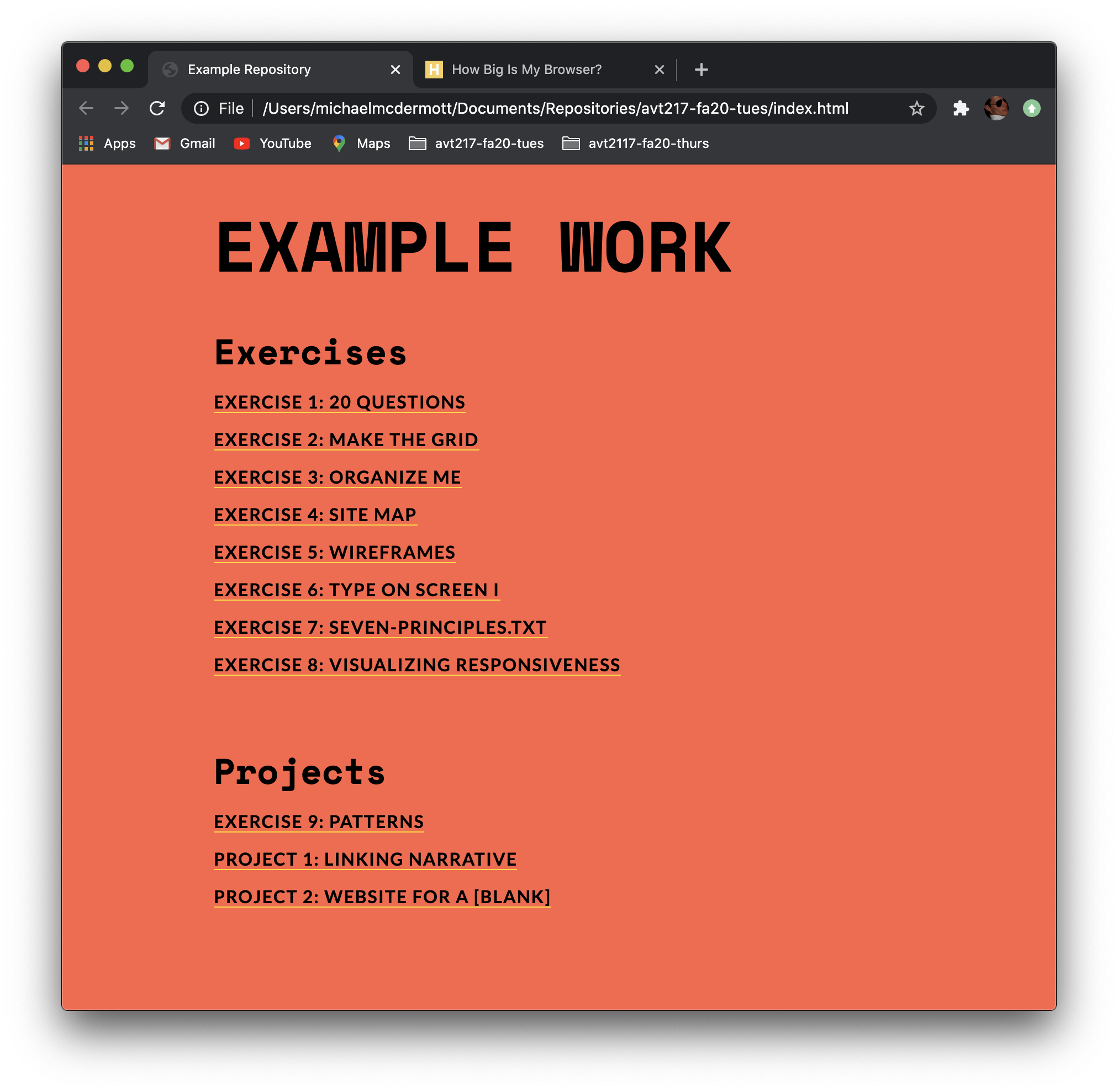
In the style rule for the columns in the media query, add a margin on the bottom to separate the two stacked columns. In this case I am going to use margin-bottom: 50px; because that is the only margin I want to change. If this has other margins on it in my main styles and I write margin: 0 0 50px 0; it is going to override any existing margins on the top, left, and right and set them to zero. Not something that I probably want to happen.
Step 4: Adjust Other Styles
Now that we have gone through the basic setup of making a page responsive, we can make other changes that need to happen when your page gets narrower. For my page I’m going increase the width of the main and header elements so there is more room for the type. I might decrease the size of the h1 element so it isn’t quite so big. I could go through and change a lot more if I wanted to but the goal here is to make the existing designs look their best on a smaller screen, not redesign the site.
And again, I’m only using using the properties I want to change or add so I don’t need to include margin, padding, or the font-family in the media query because I’m not making any changes to them. I also didn’t have to make any adjustments to the HTML file just reference it to make sure I’m changing the correct elements or classes.
