6. Making Columns
This tutorial will go through the process of setting up a two column layout with floats and divs using your main index.html file and its associated CSS file to work with.
Step 1: Open Your Repository and Files
Open your repository in Atom and then open up your main index.html file and CSS file associated with it by double clicking on the files in the tree view.
Once both are open you can view them side by side by dragging the the tab with your CSS file to the right until the right column is highlighted. Once it is highlighted you can let go and you should be able to see both files as a split screen in Atom. If you don’t want to work this way that’s okay.
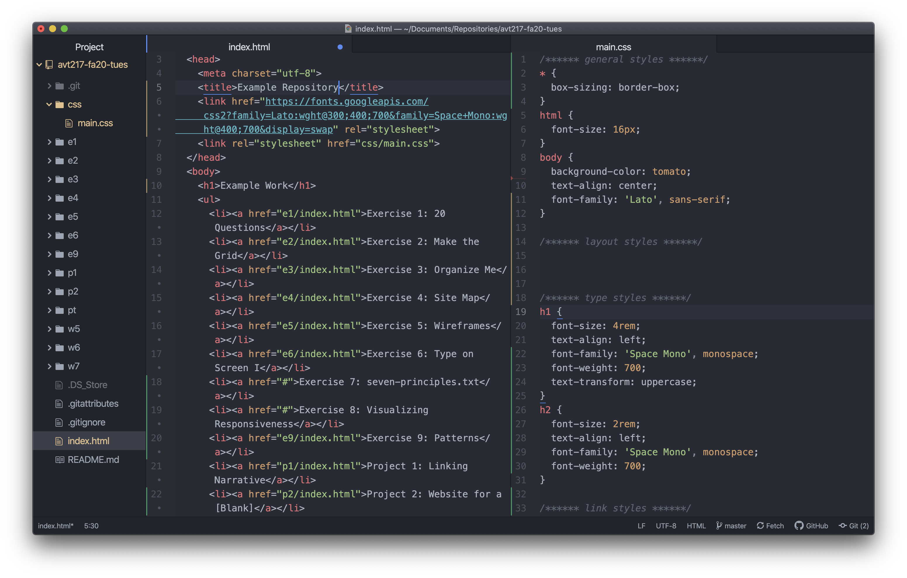
The HTML file in the screenshot should closely resemble your HTML file but the CSS file might look different than yours which is okay.
Step 2: Section off the HTML file
We are going to work in the HTML file first and get all of our content structured in a way that will be easy to modify with CSS later. The goal of this step is to wrap content in the HTML file in semantic elements (header, main, etc.) or div elements. So let’s start with the semantic elements by adding a header element and a main element to the page.
Step 2a: Adding a Header Element
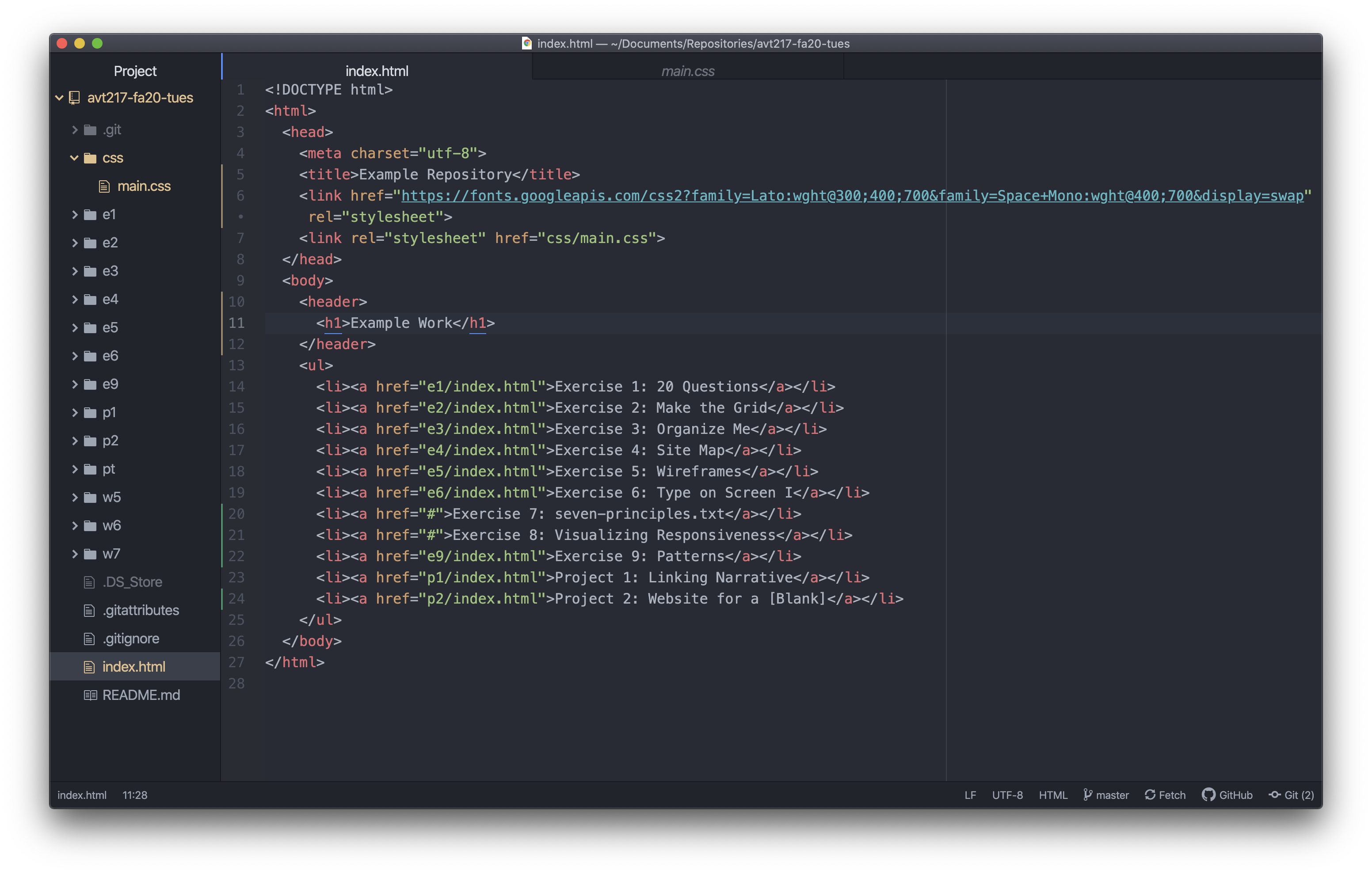
The header element should contain content that would go in a … header (no better way to explain it 🤦). The main heading on this page seems like good content to go there. Wrap the h1 element in a header element. This means adding an opening tag for the header on a new line above the h1 element, indenting the h1 element one level because now it is a child of the header element, and then adding the closing tag for the header on a new line below the h1 element. Should look something like the below.
Step 2b: Adding a Main Element
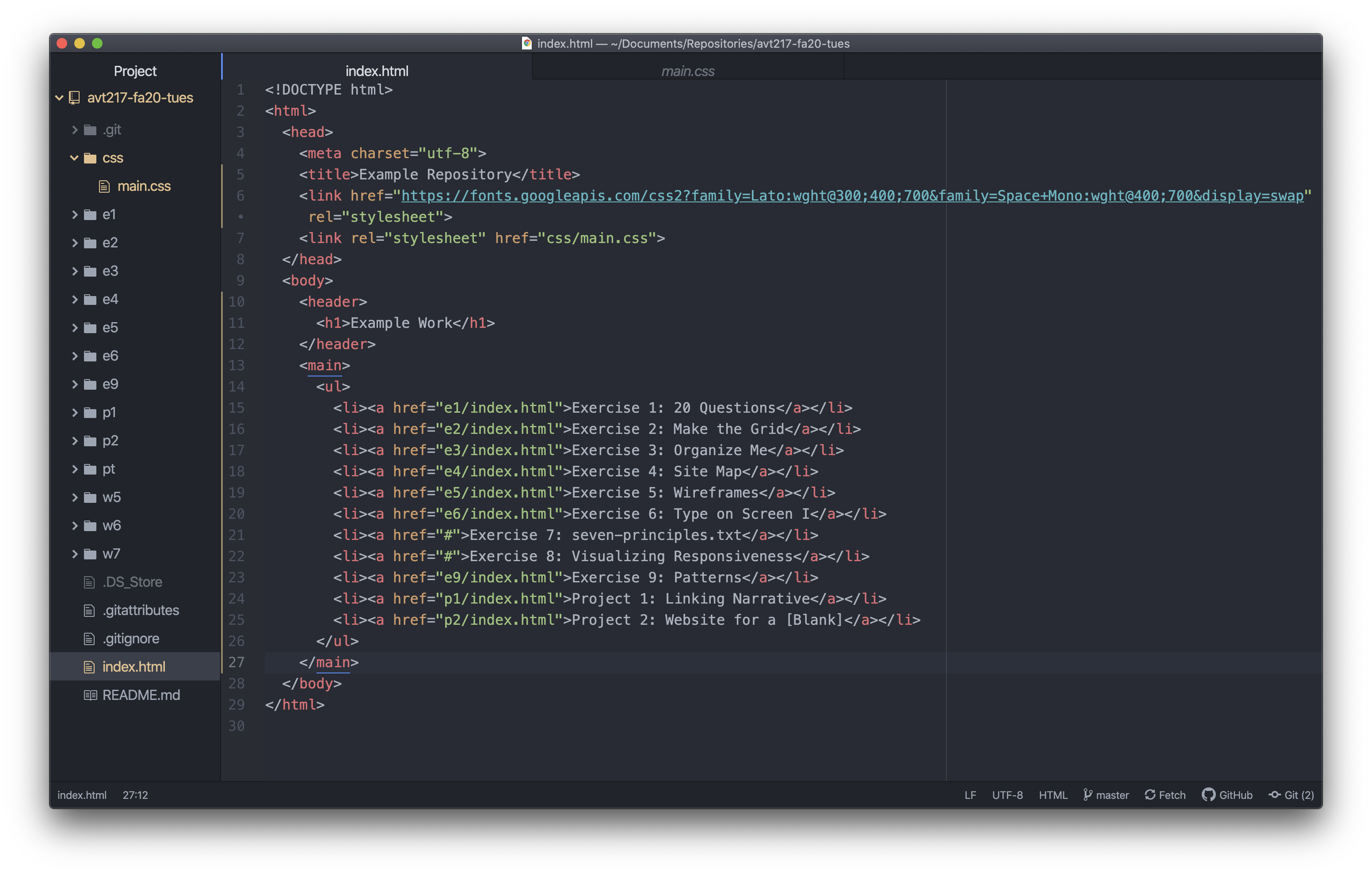
Next we want to do a similar process with the other content on the page (which in this example is the ul and all the content it contains). This time though, instead of the header element we want to use the main element. The main element represents the dominant content of the body element, which in this case is the list of links.
So now wrap the rest of the content in your body in the main element. Make sure you have an opening tag before all the content you want to contain, a closing tag after all the content, and that the content inside the main element is indented appropriately.
Step 2c: Splitting the List
Next we want to split the unordered list into two unordered lists. We want to do this because one column of this page is going to be exercise links and the other column is going to be project links.
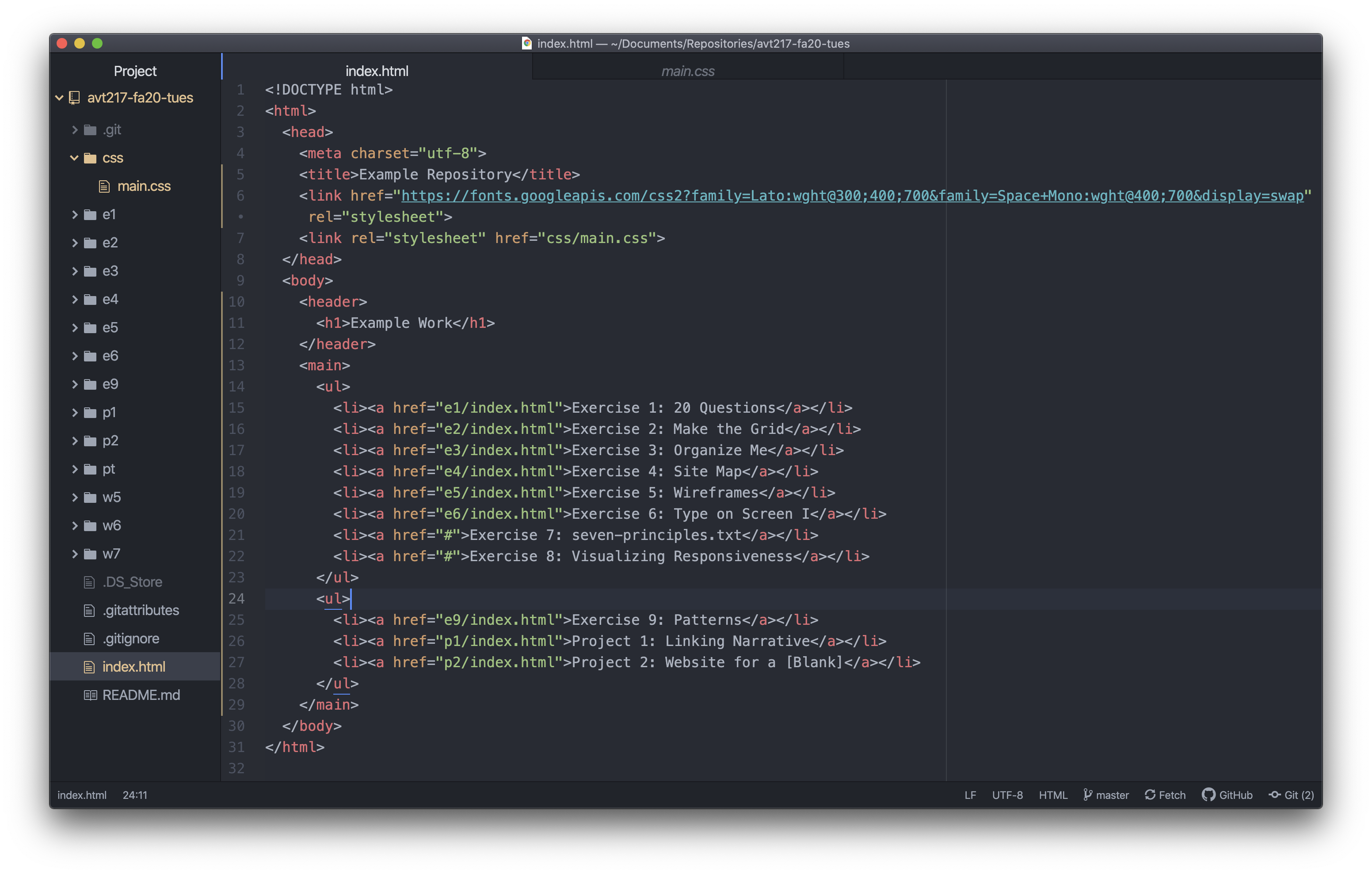
The unordered list should be split up with a list for exercises and a list for the project. To do that just go to where the last exercise is and close the ul after it and then open another one after that. This is lines 23 and 24 in the screenshot below.
Step 2d: Adding Two Div Elements
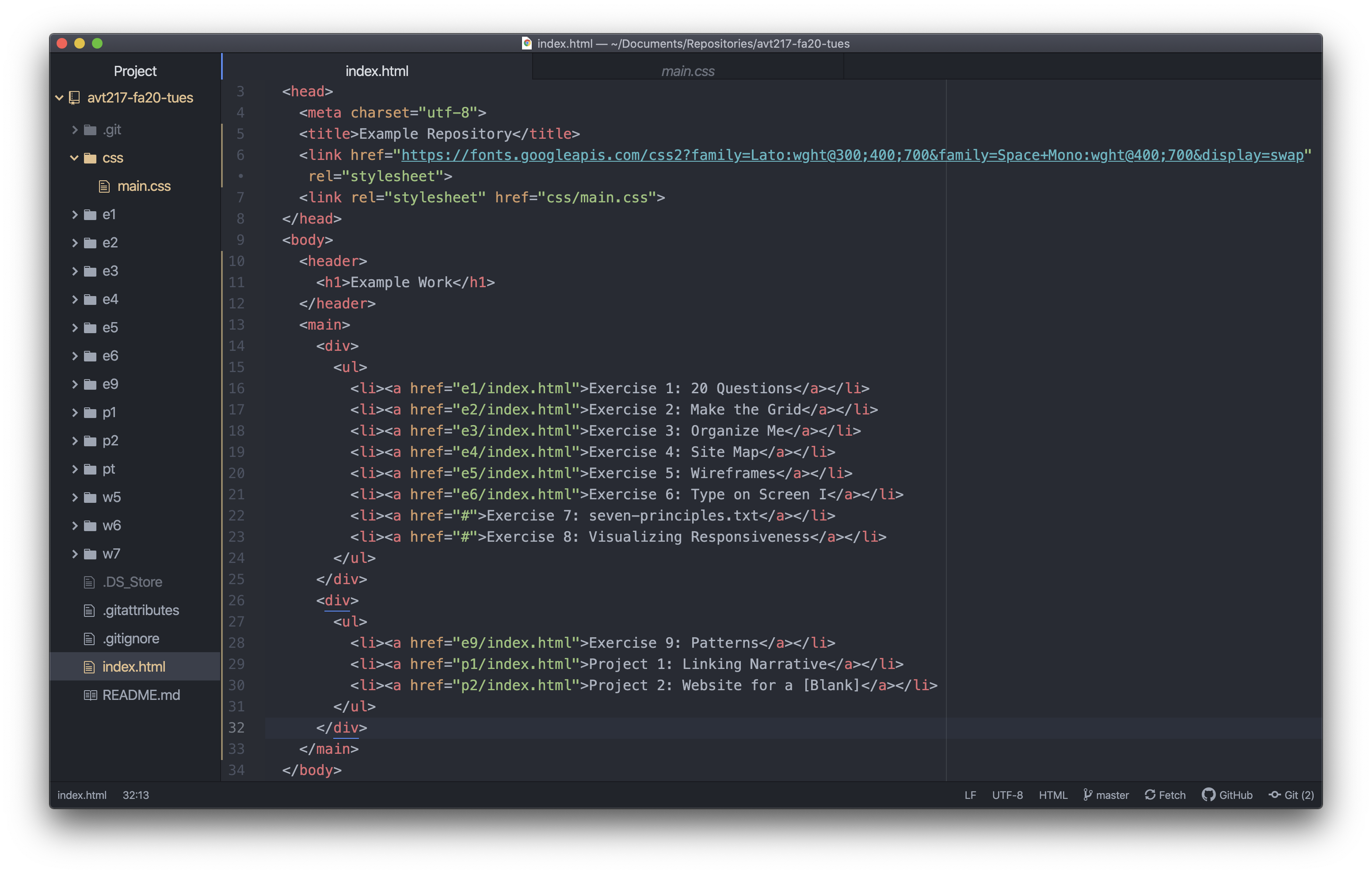
Finally we want to wrap each list in its own div element so we can add styles to make two columns instead of the single column that it is right now.
Before each ul add an opening div tag and after each ul add a closing div tag. Don’t forget to indent contained elements one level each.
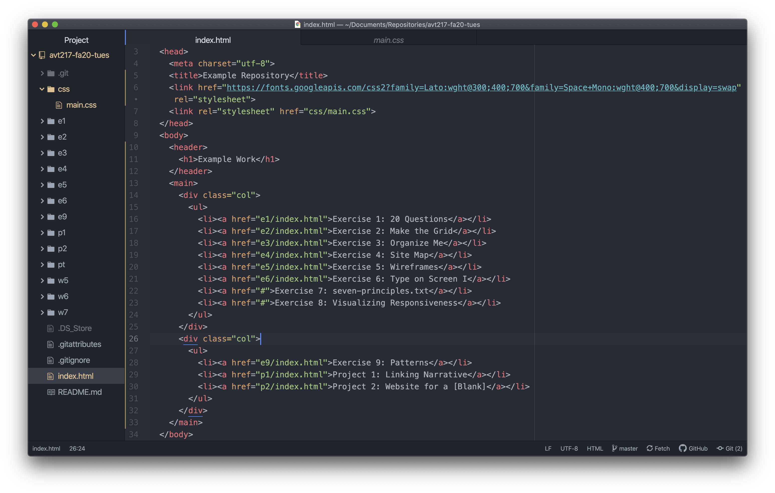
The last step here is adding a class to the div elements. Since these are two equal columns and they are probably going to have the same styles we can give them both the same class name. It could be whatever you want but I’m going to use “col” to keep it short and informative.
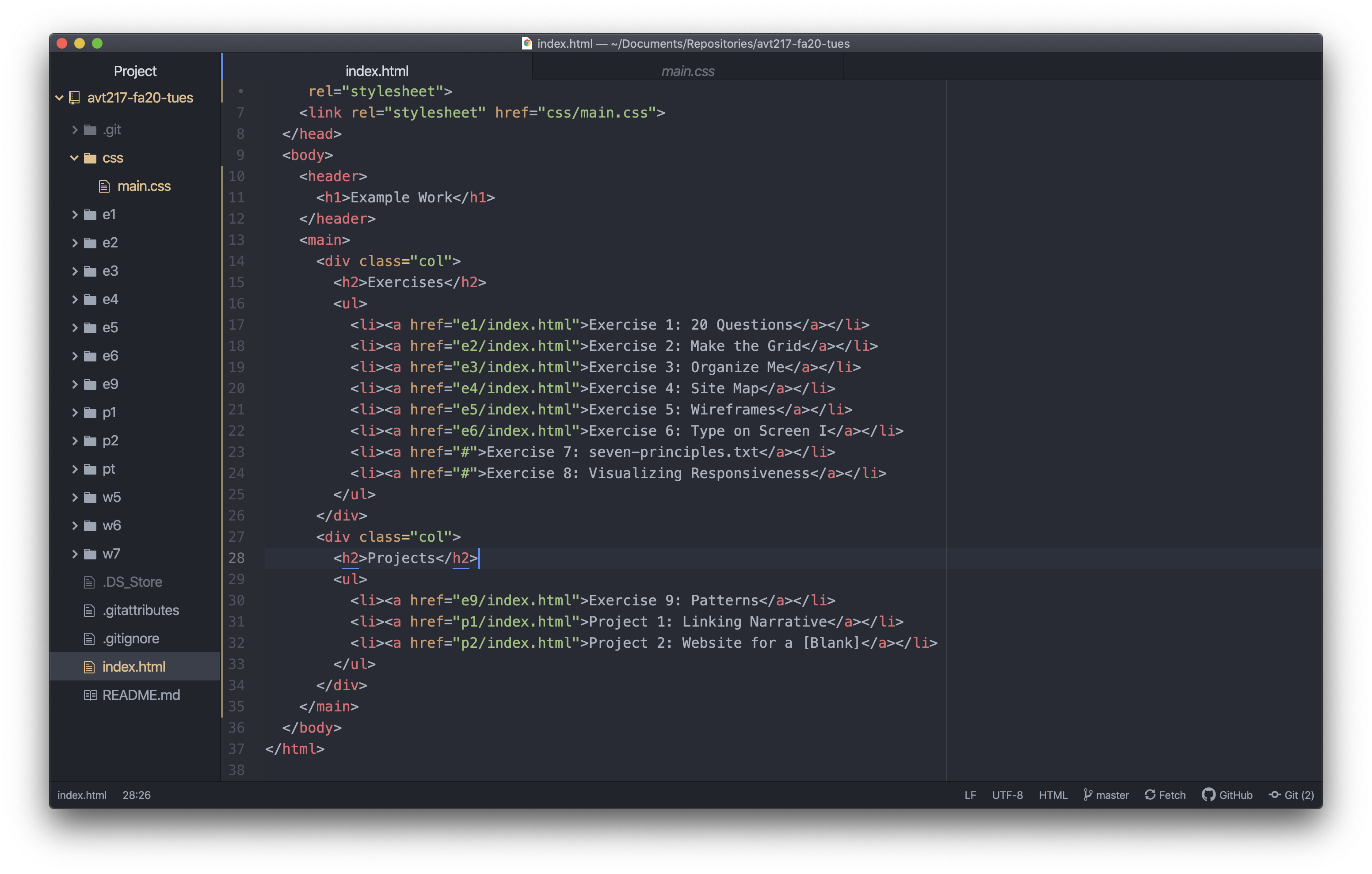
Now you should have a nicely sectioned and formatted file that has a header, a main, 2 ul’s, and 2 div’s each with the “col” class. I’m also going to add two heading elements in each column to show which column is which. Not something you have to do but helpful for someone who might be unfamiliar with the site.
Now if you save it and preview the file you will see that nothing really changed with the exception of the list now being two lists.
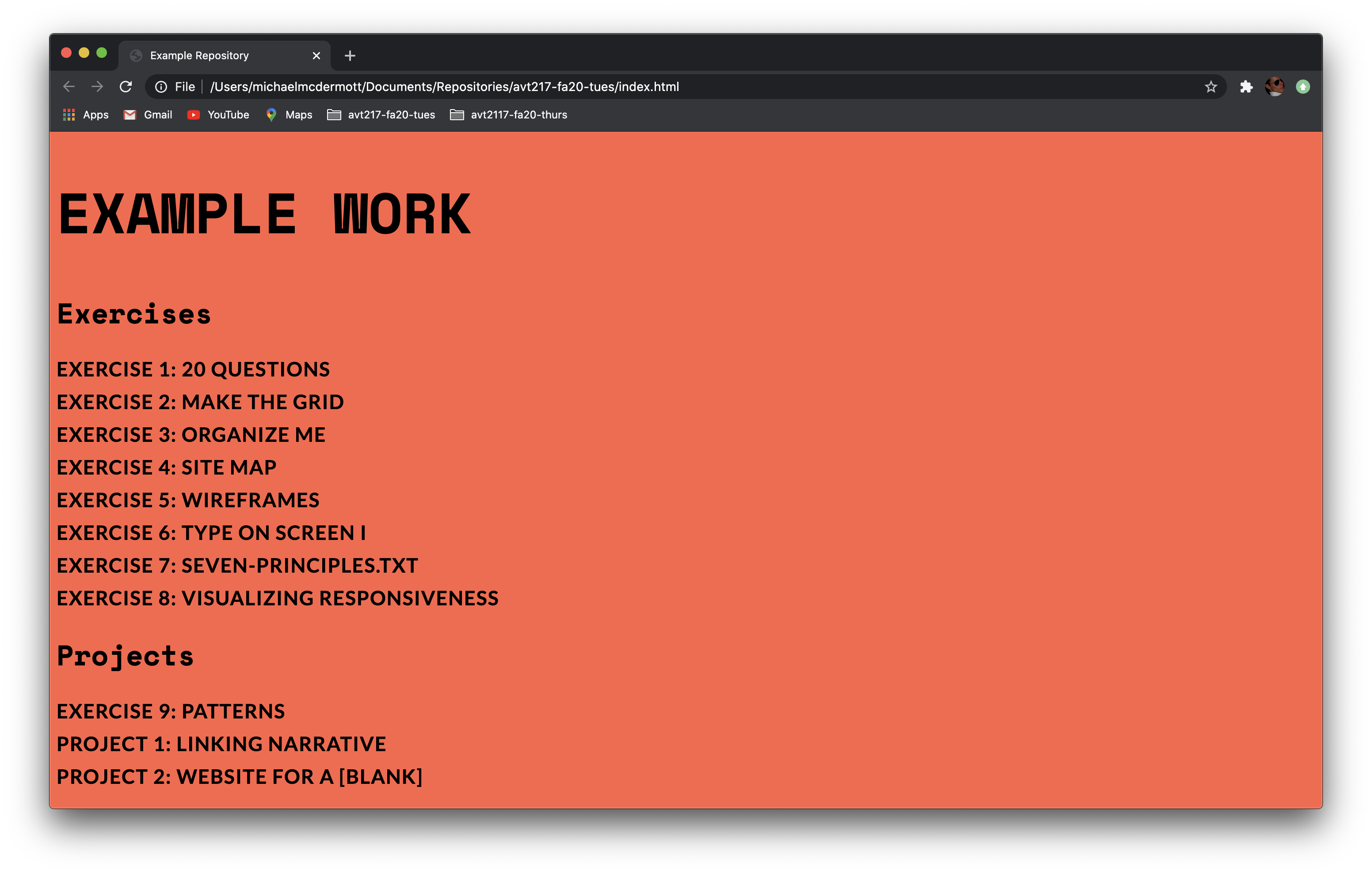
Step 3: Adding Styles
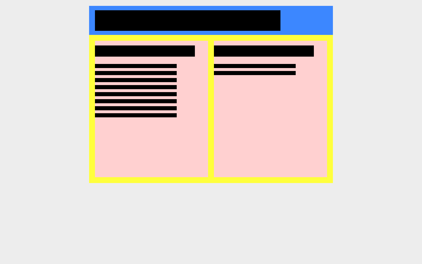
The page is structured how it needs to be in order to allow for two columns to work but we still need to add the CSS rules that make the site display like we want. The wireframe below illustrates the layout we are going for. The header is the blue box with the h1 type in there. The main is the yellow box with the two red div’s in there each containing one of the lists. We don’t want them stretching across the page so we are going to give them some widths to make the content narrower and add some margins to make that width center on the page.
Step 3a: Header Styles
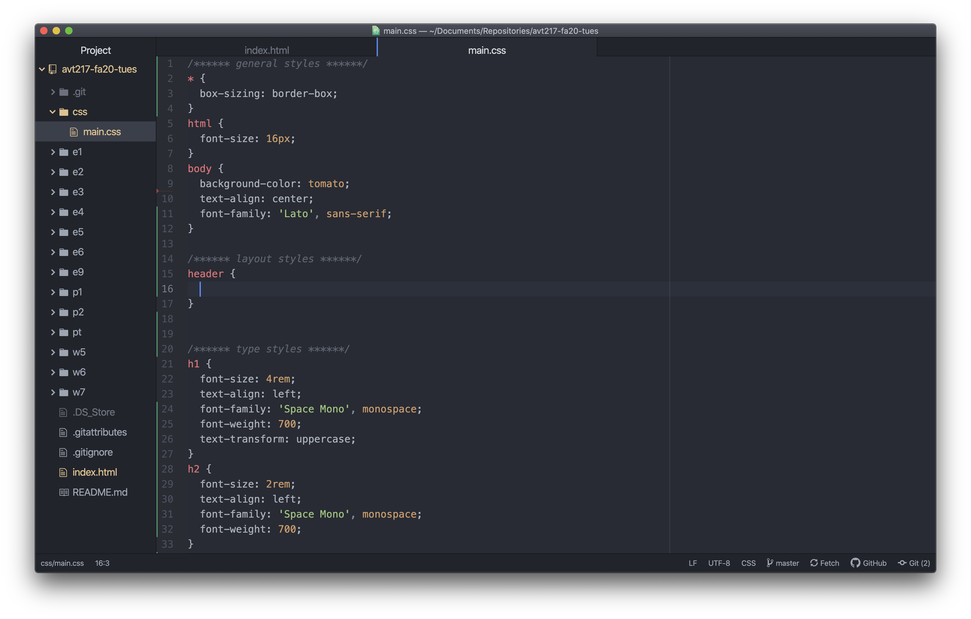
Let’s start at the top with getting the header element into its place. I added some comments to my CSS file to note where my general, layout, type, and link styles are to help keep me organized. The styles we are getting ready to add are going to go under my layout styles comment.
The first thing we want to do when we want to style something is write the correct selector. In this case I want to style the header element so I’ll use an element selector and type header { } on a new line. In between those two curly brackets I’m going to add an empty line so the final result will look like the screenshot below.
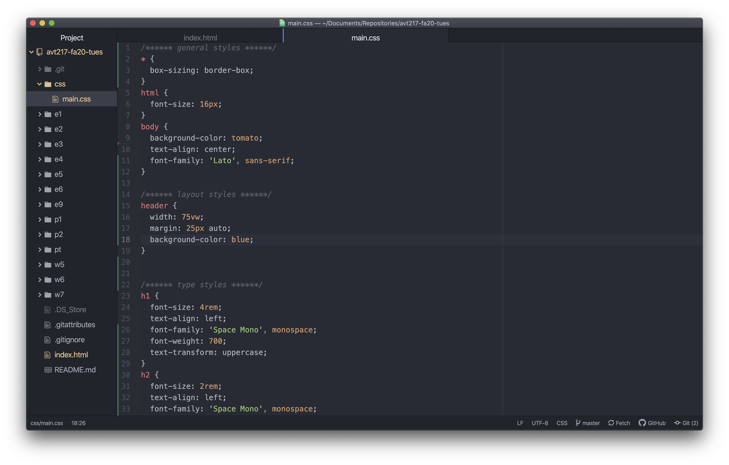
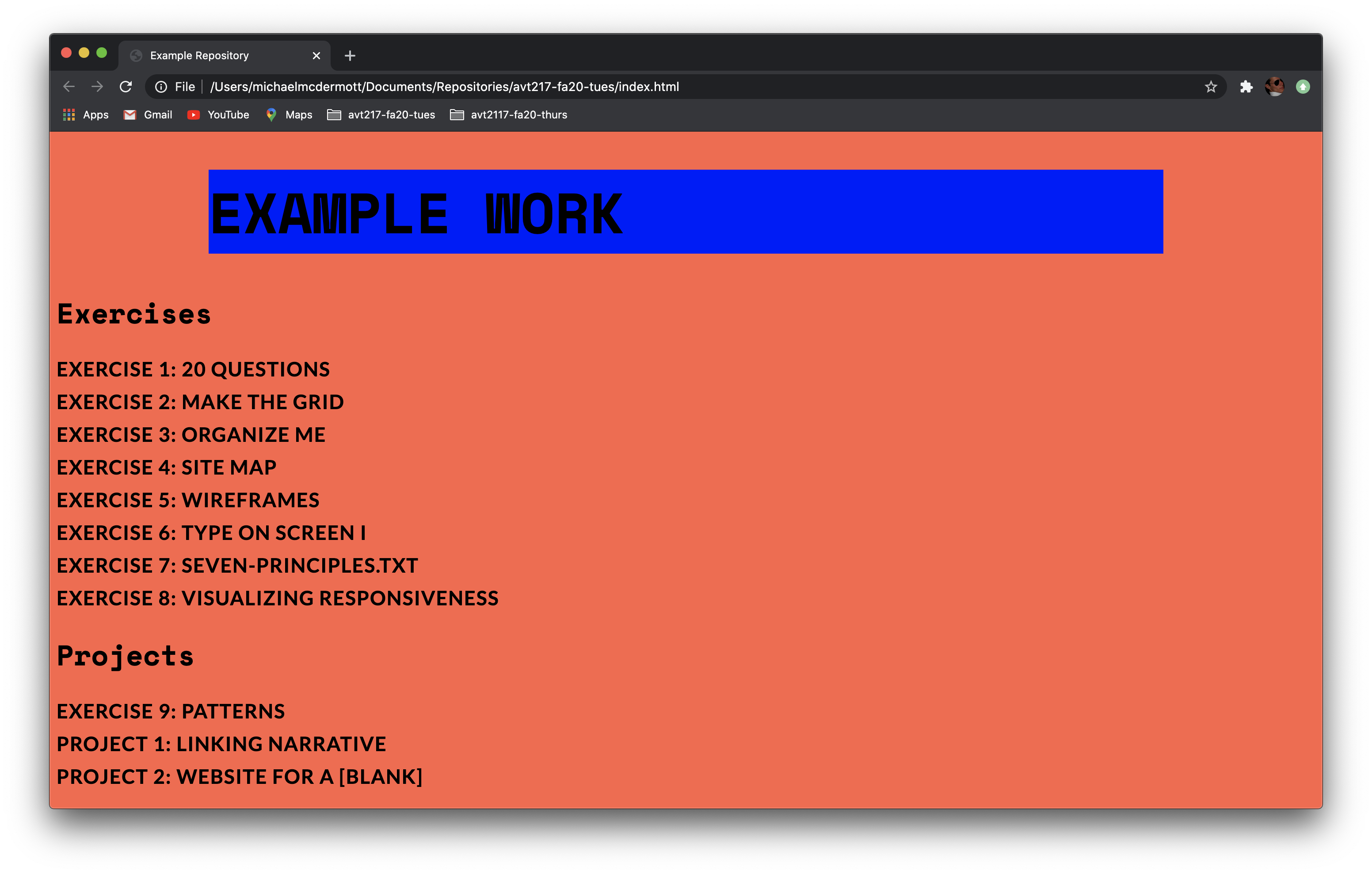
Now that the basic syntax is there let’s start writing some declarations. I know I want to change the width and make sure it is centered on the page so I’m going to add the width property and the margin property. I’m also going to add a background-color to this so we can see what is happening and remove it later. The value for the width is up to you. I’m going to start with 75vw (vw stands for viewport widths so 75vw equals 75% of the width of the window) for the width and add a blue background color to keep true to the wireframe. For the margins I want the top and bottom to be 25px and I want it to be centered on the page and I want to write this all as one declaration. There is an easy way to get the element to center on the page once I have given it a width. Do you remember what it is and how to write the margins as one declaration? Check your answer here margin: 25px auto.
Save the CSS file (and make sure the HTML file is saved) and preview the HTML file. Mine looks something like this.
Step 3b: Main Styles
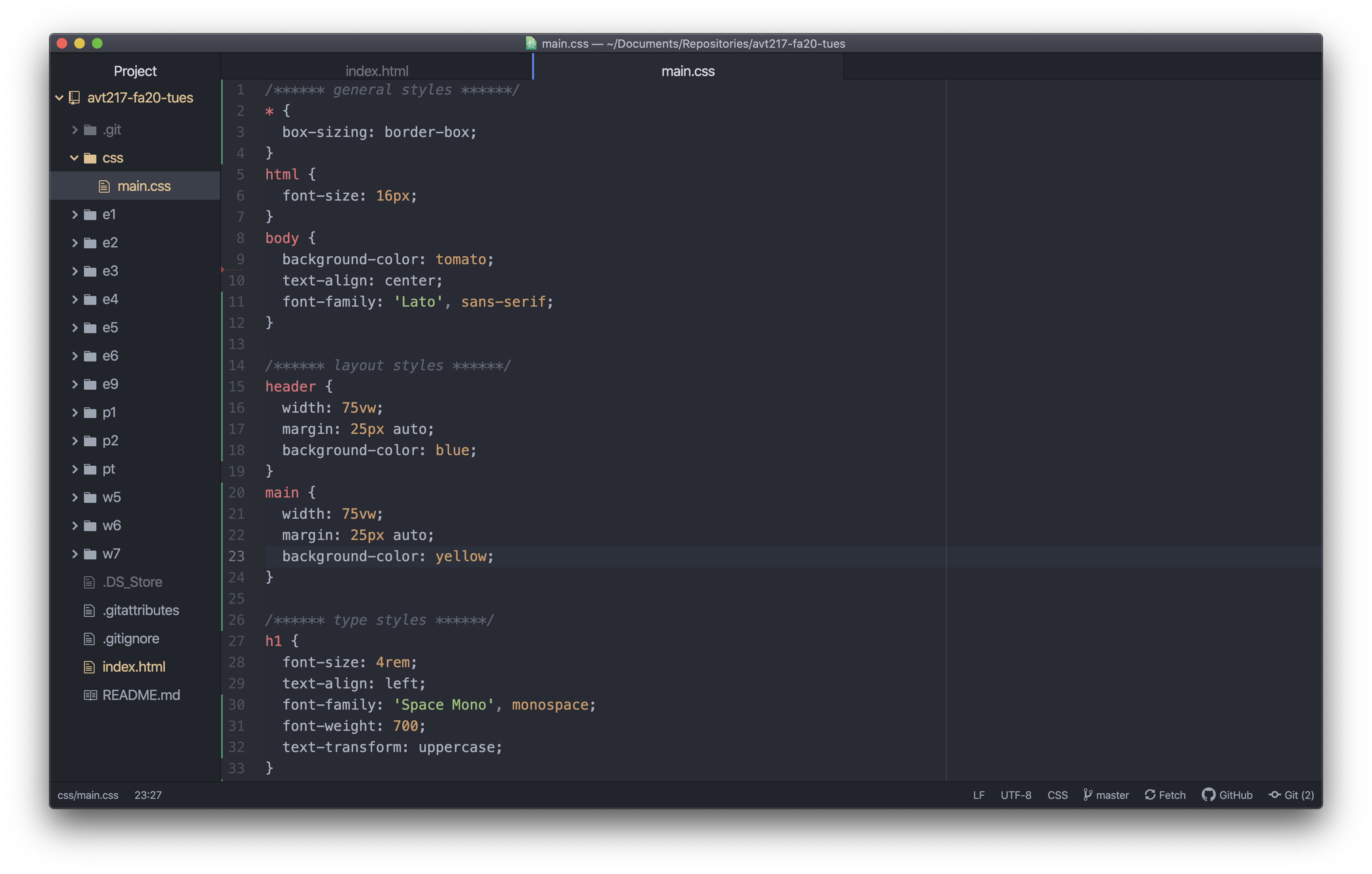
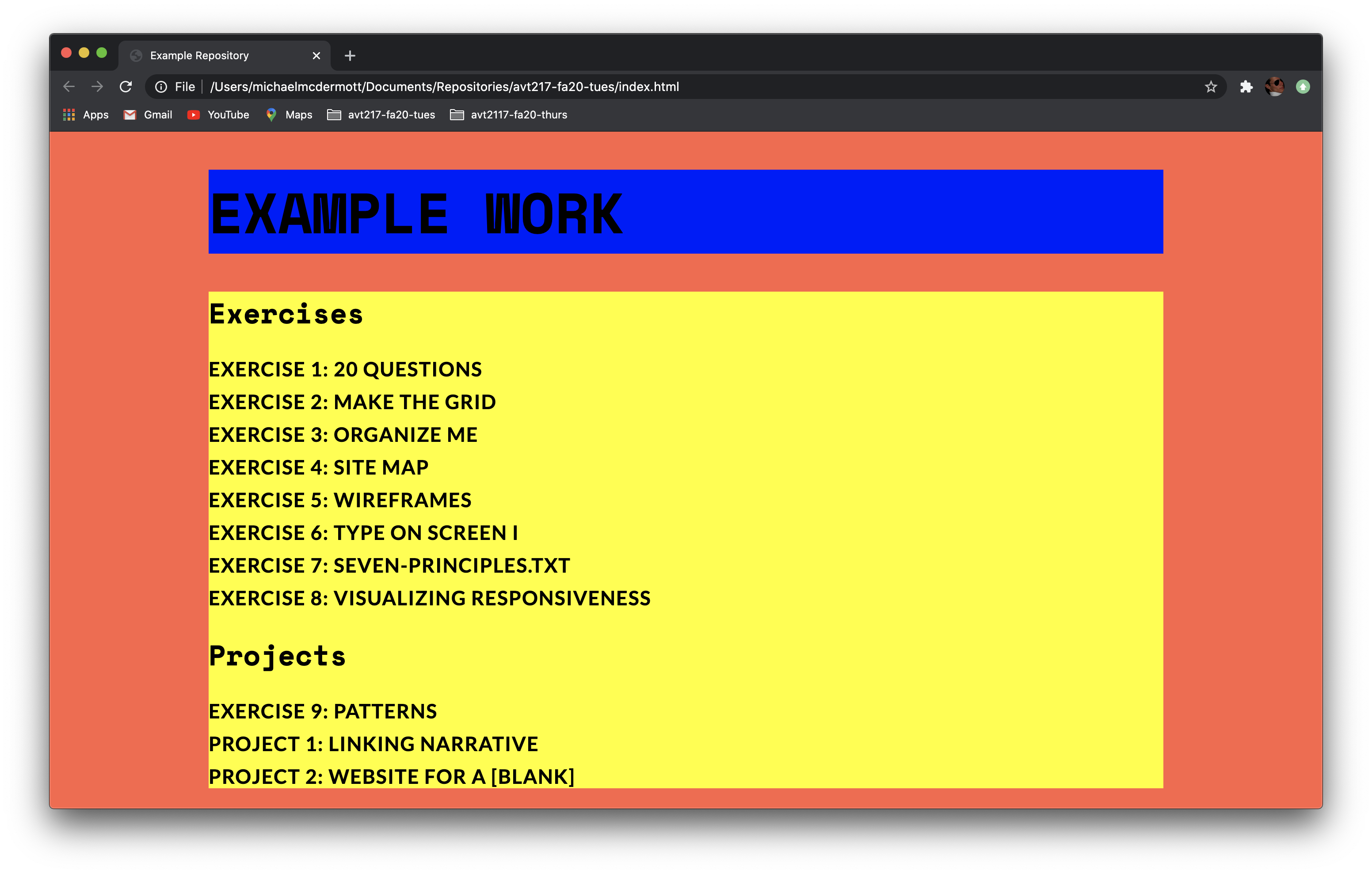
We are going to repeat that same process for the main element. The only change is instead of a blue background we are going to give it a yellow background.
So your code should look something like this.
And your site should look something like this.
3c: .col Styles
The final step is getting the columns to show up side by side. Since we have a class for our div elements we are going to use that as our selector instead of the element selector div. This is because the class selector is more specific which in this case isn’t a big deal because the only two div elements on the page have the “col” class but you can imagine if there were more div elements that had other classes we couldn’t just use the div element selector to style them.
So in the CSS file we want to use the class selector .col.
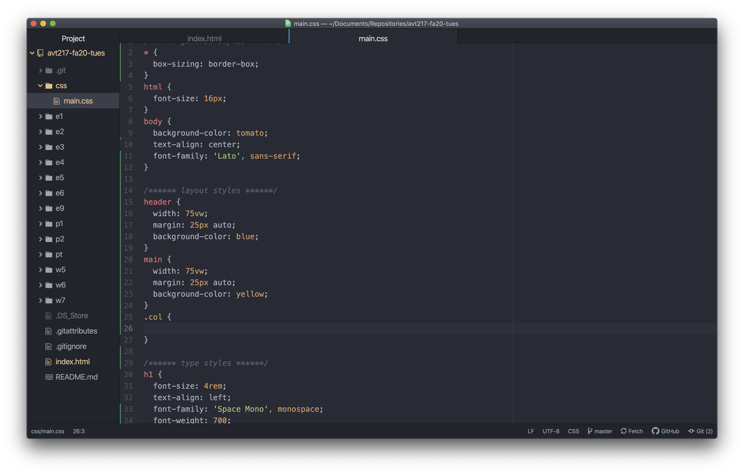
The first thing we need to do is add a width. Now there is an easy way to make these half as wide as there parent elements. Do you know what it is? width: 50%; is correct! This works well for us because percentages are based on the width of the parent element. So instead of trying to figure out half of 75vw we can just write 50% and the computer does the work for us. We are also going to add a background-color here so we can see what is going on.
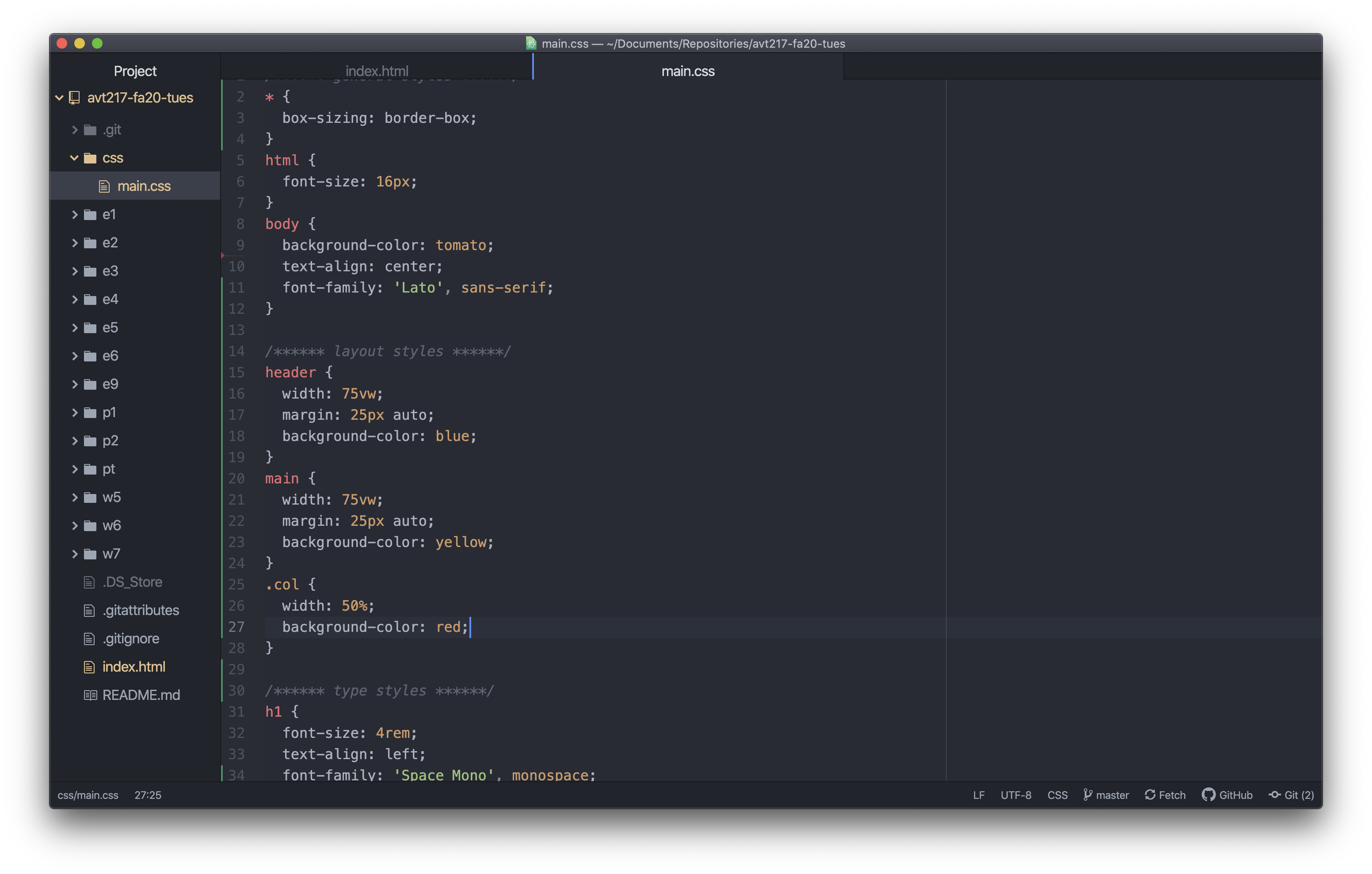
If you preview the page it should look something like the below. The columns are half the width of the main element but they aren’t sitting next to each other yet.
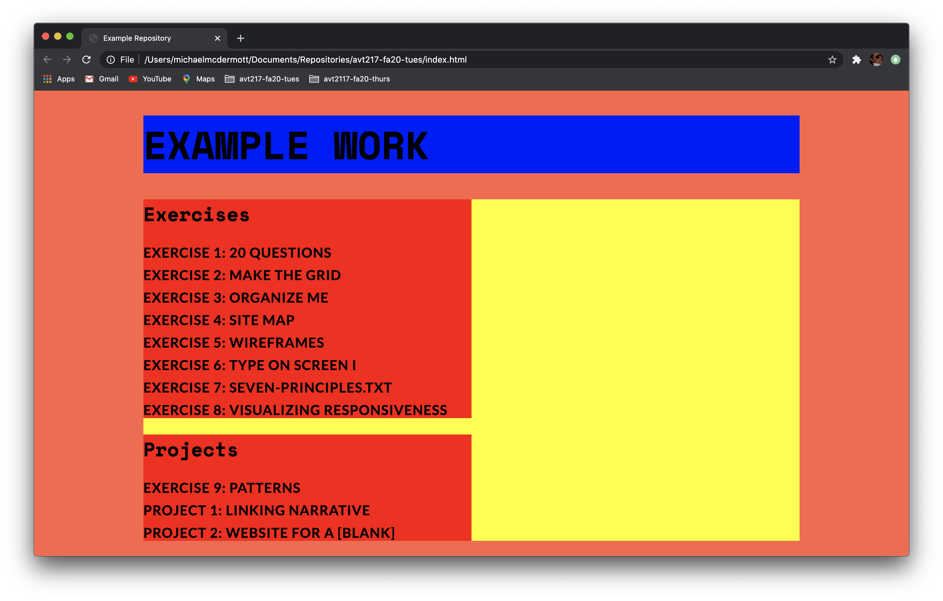
To get these to sit next to each other we need to add a new declaration. Do you know what it is? If you said float: left; you are correct.
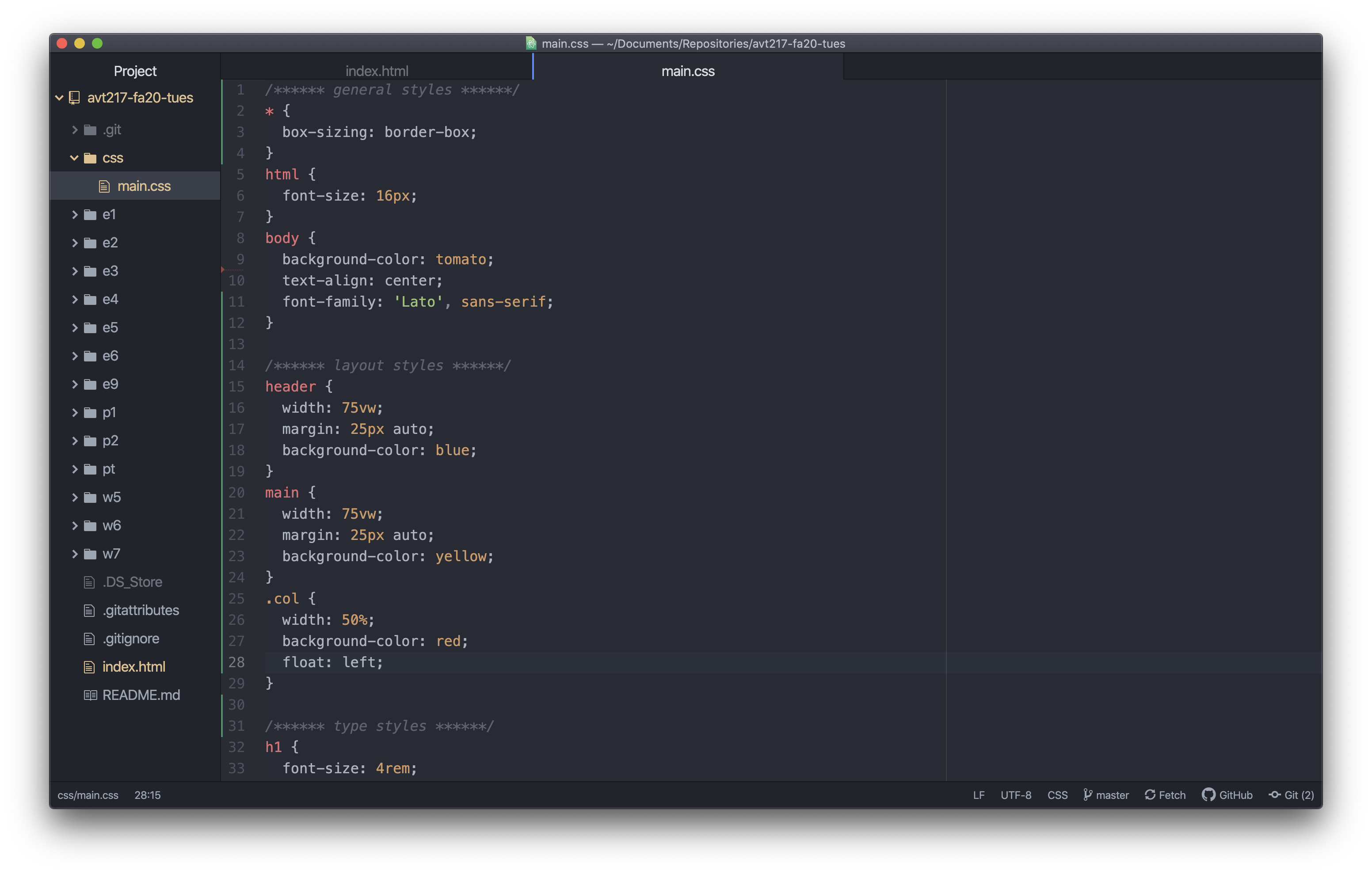
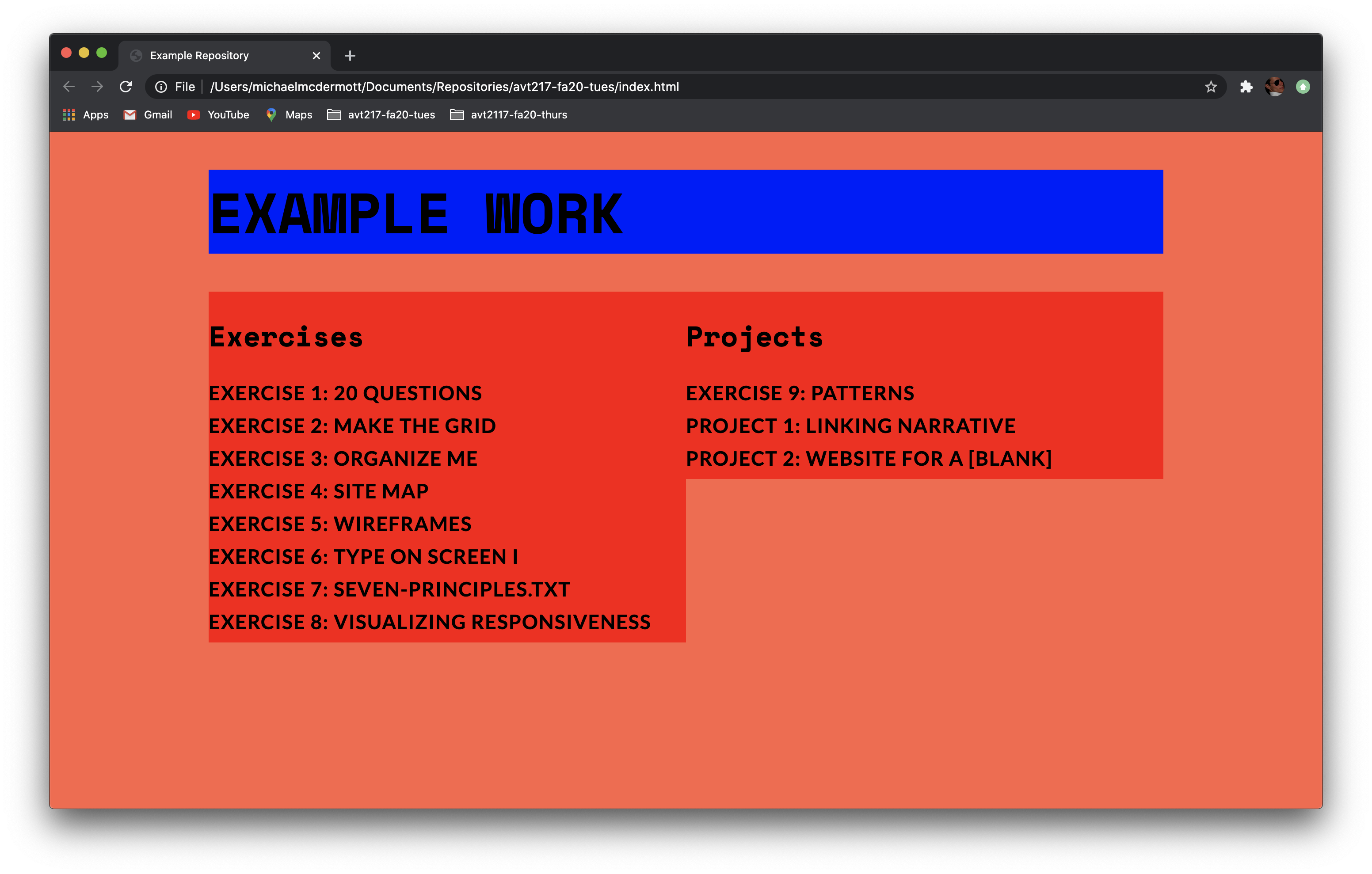
But if you notice on the previewed page the yellow background for the main element disappeared. Remember from the Floats lecture that when you float objects they get removed from the normal flow so the containing element does not think any floated elements are contained inside it so the height changes to the height of any none floated elements it is containing (which in this case the height is 0 because there are no elements that aren’t floated inside the main element). To fix this we need to add one more line of code to the main CSS styles. Once display: flow-root; gets added to the styles for the main element the yellow background comes back to the height of the longer red column.
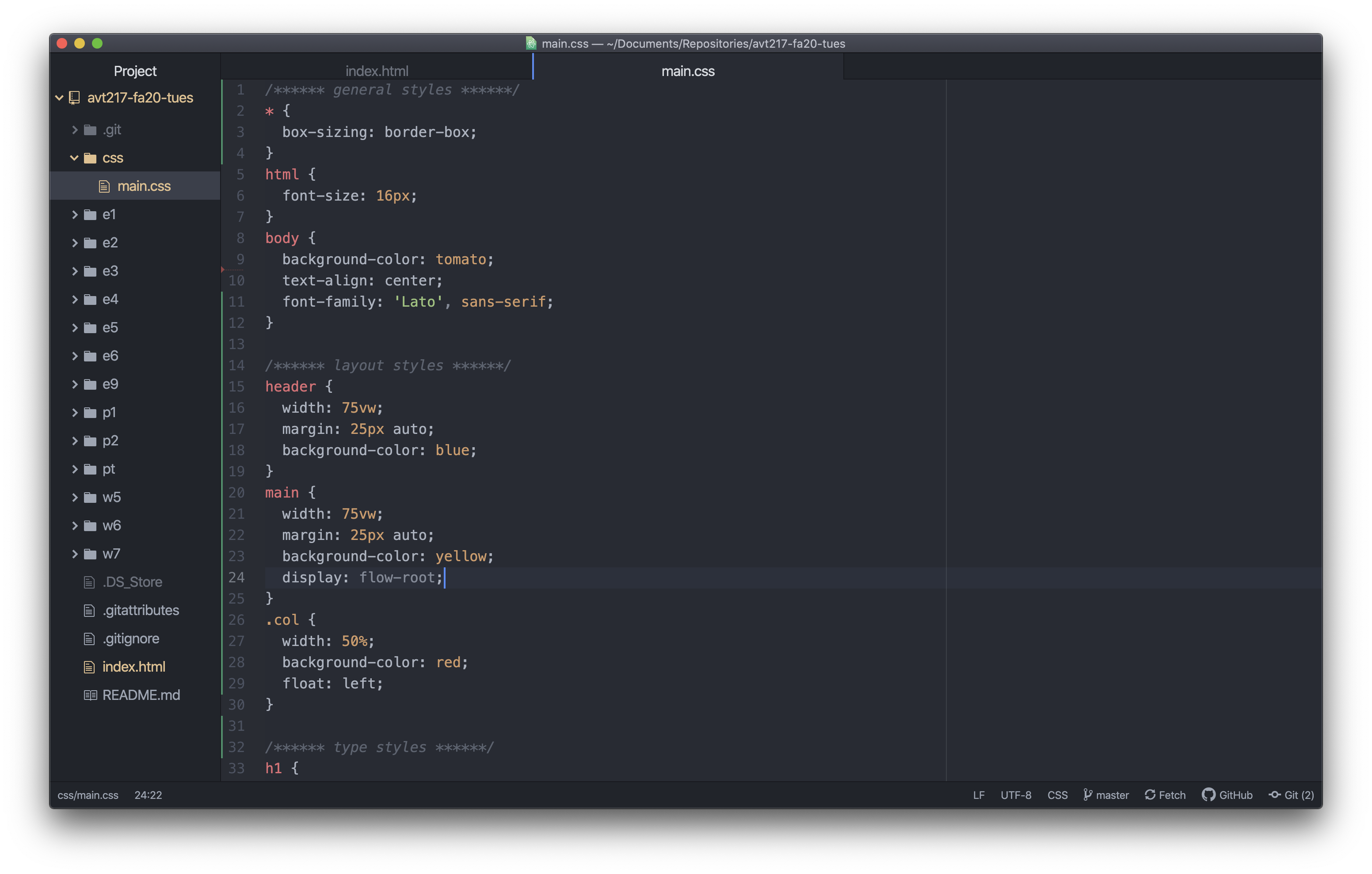
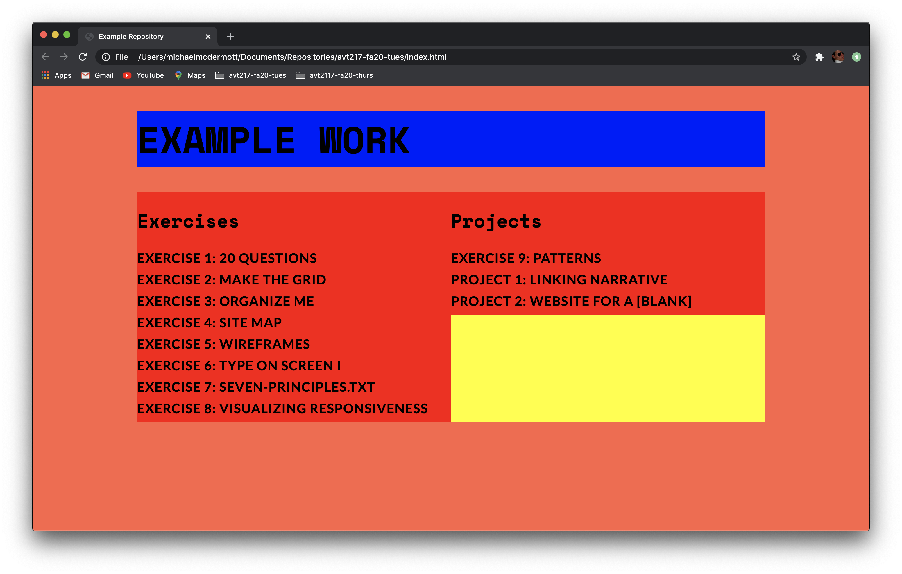
After you remove the background colors you have reached the end. There is more we could do here as designers (and probably should do for practice). We could change the margins on the columns so that if the columns get too narrow the type won’t touch. If we added margins we would also have to account for that in the widths of the columns. We could add padding instead which doesn’t have to be accounted for in the width as long as you have the box-sizing set to border-box for the universal selector. That would push the content away from the edge of its box and fix the issue of type touching if the columns got too close. Some other things to make sure you are adding here are styles for your links, importing fonts from Google or Adobe, colors, sizes, all the styles to make the page look great.
